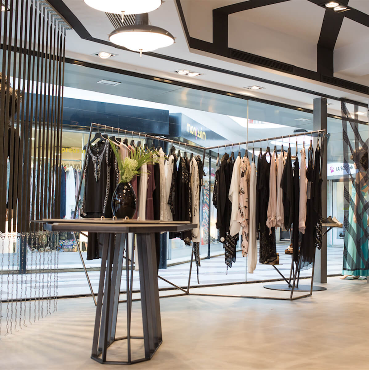
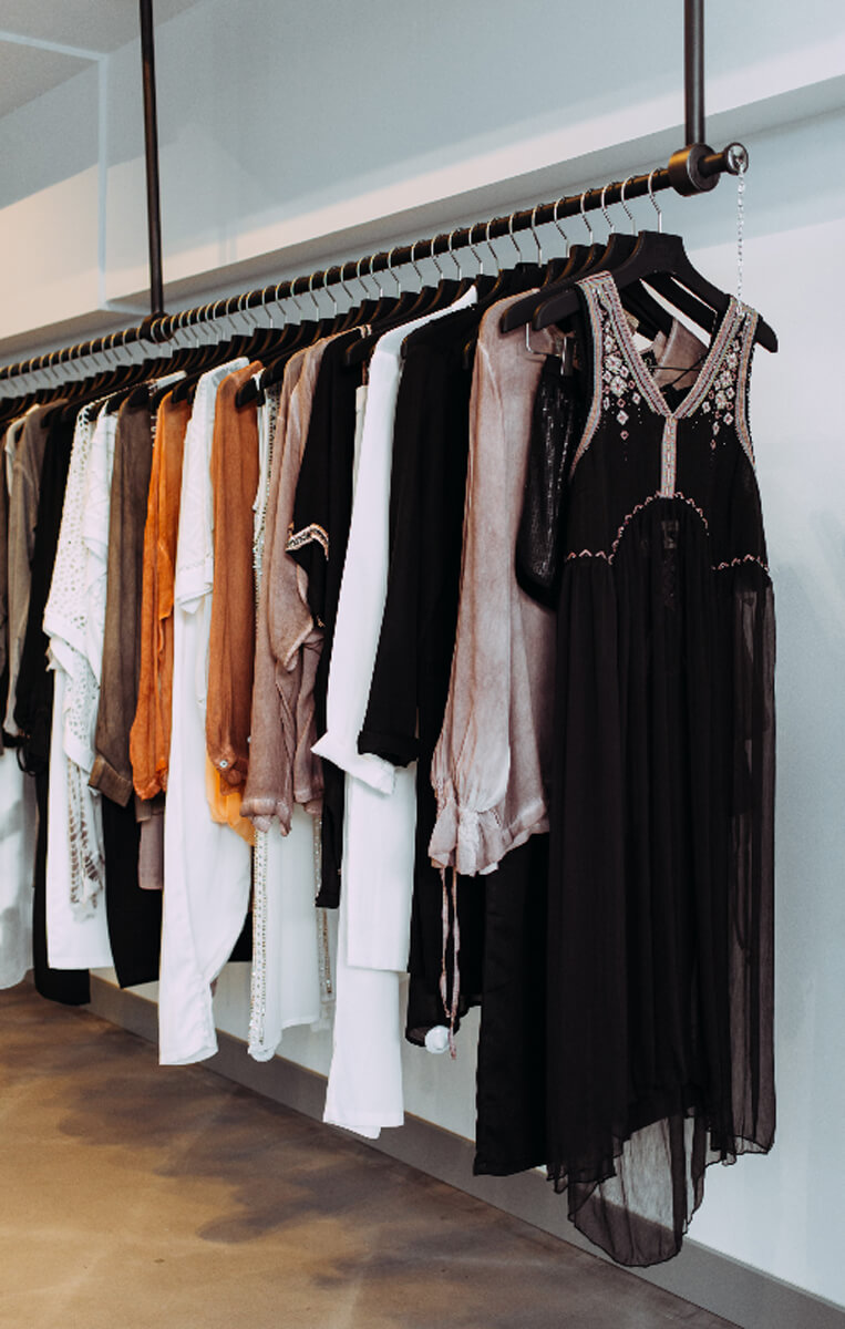
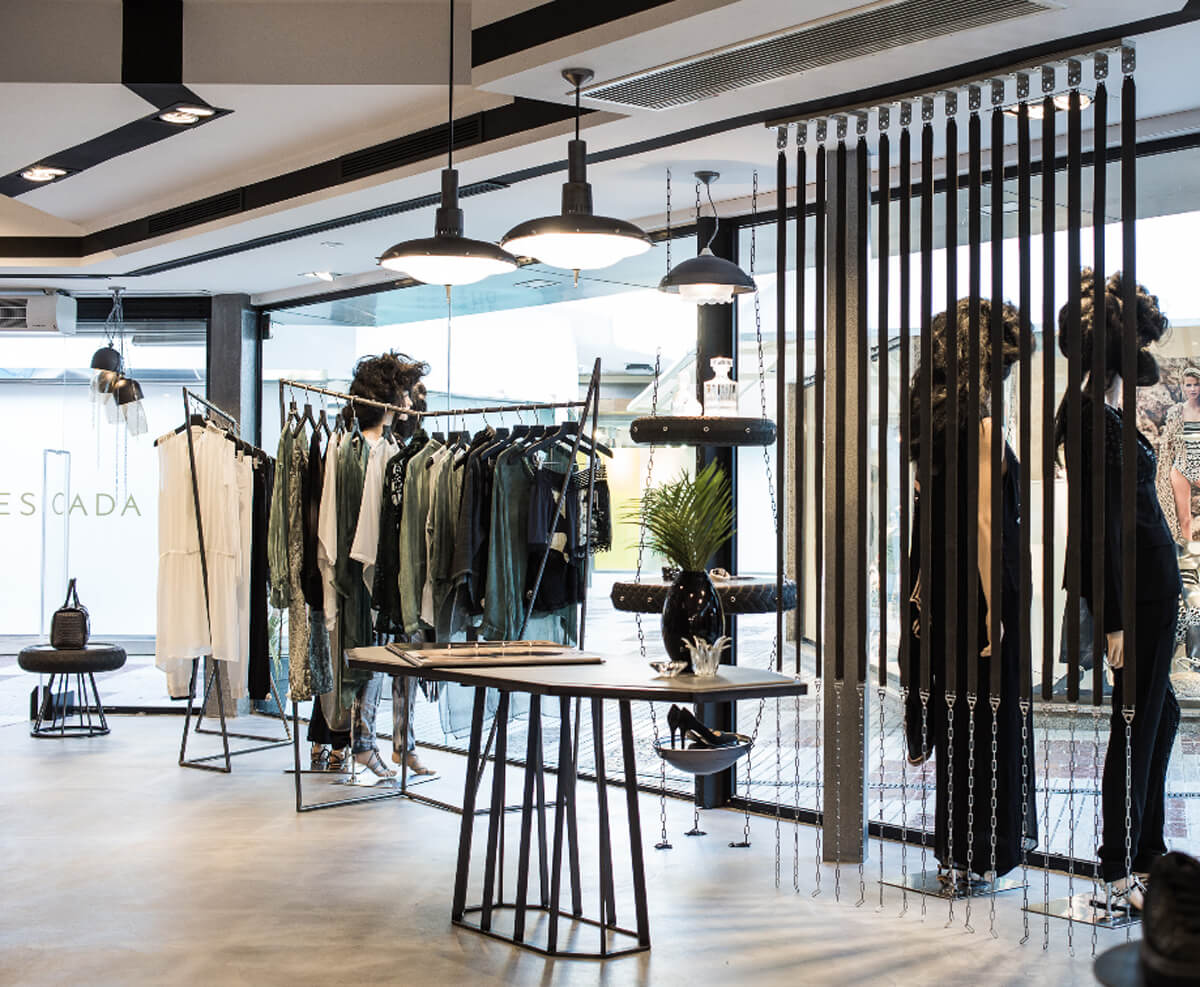
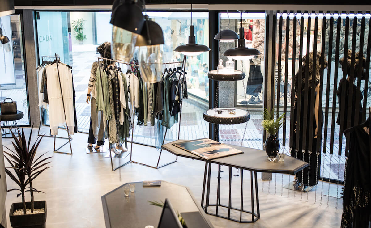
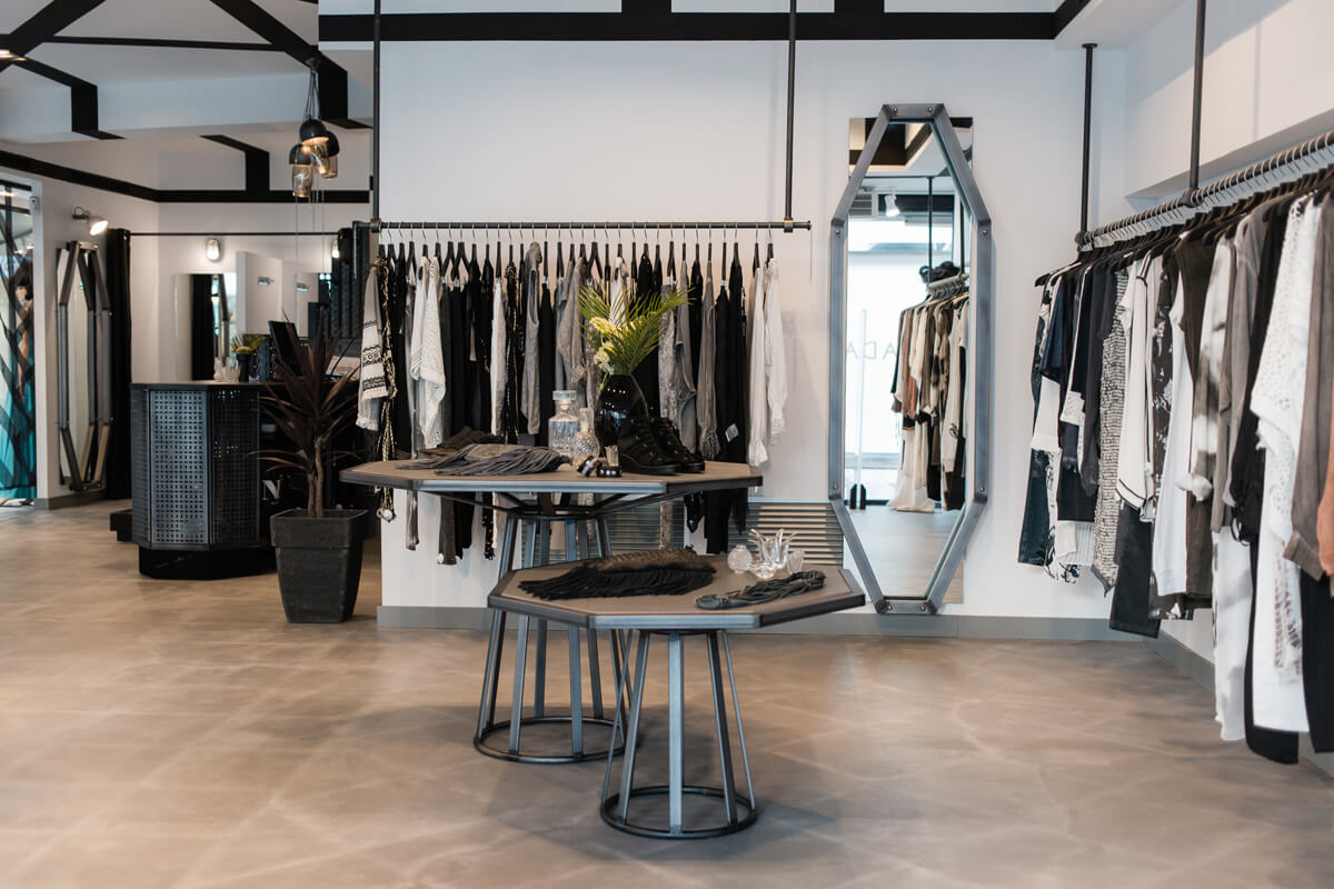
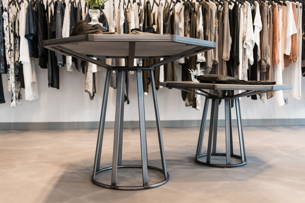
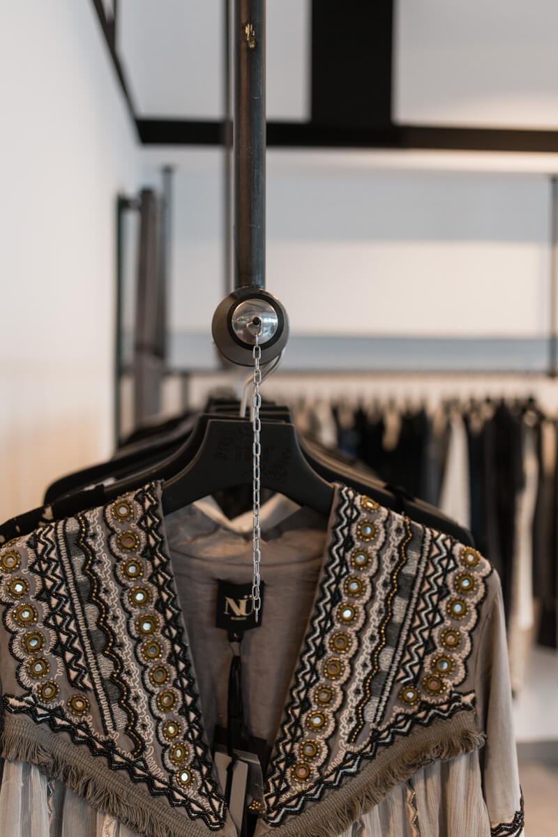
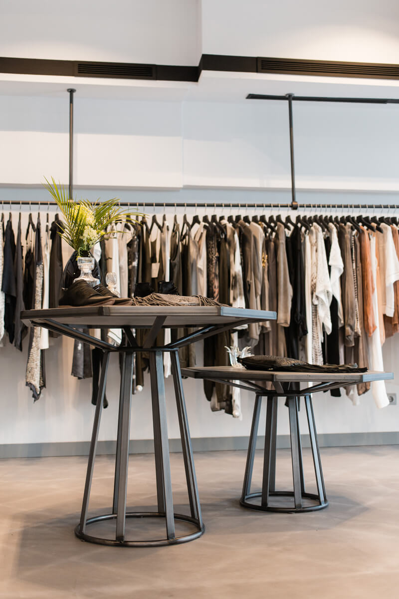
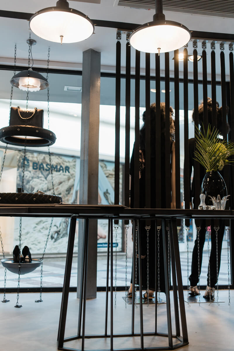
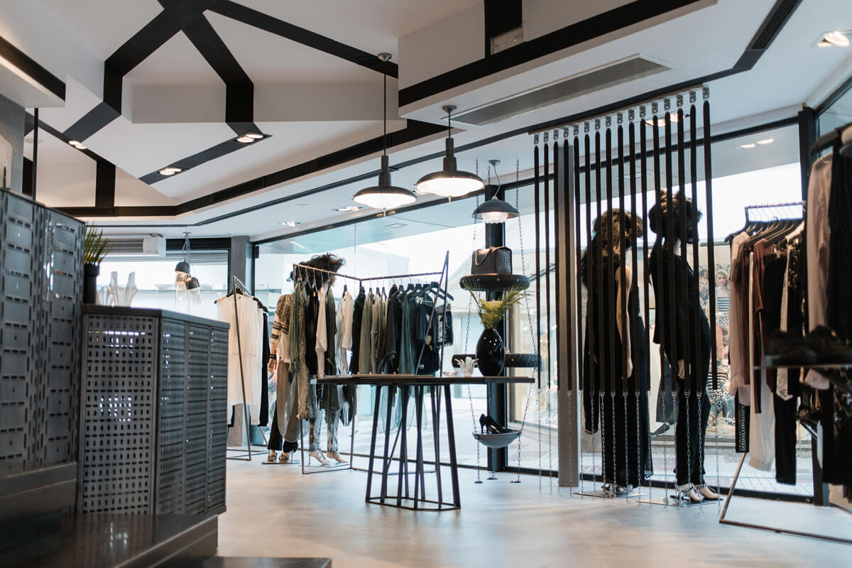
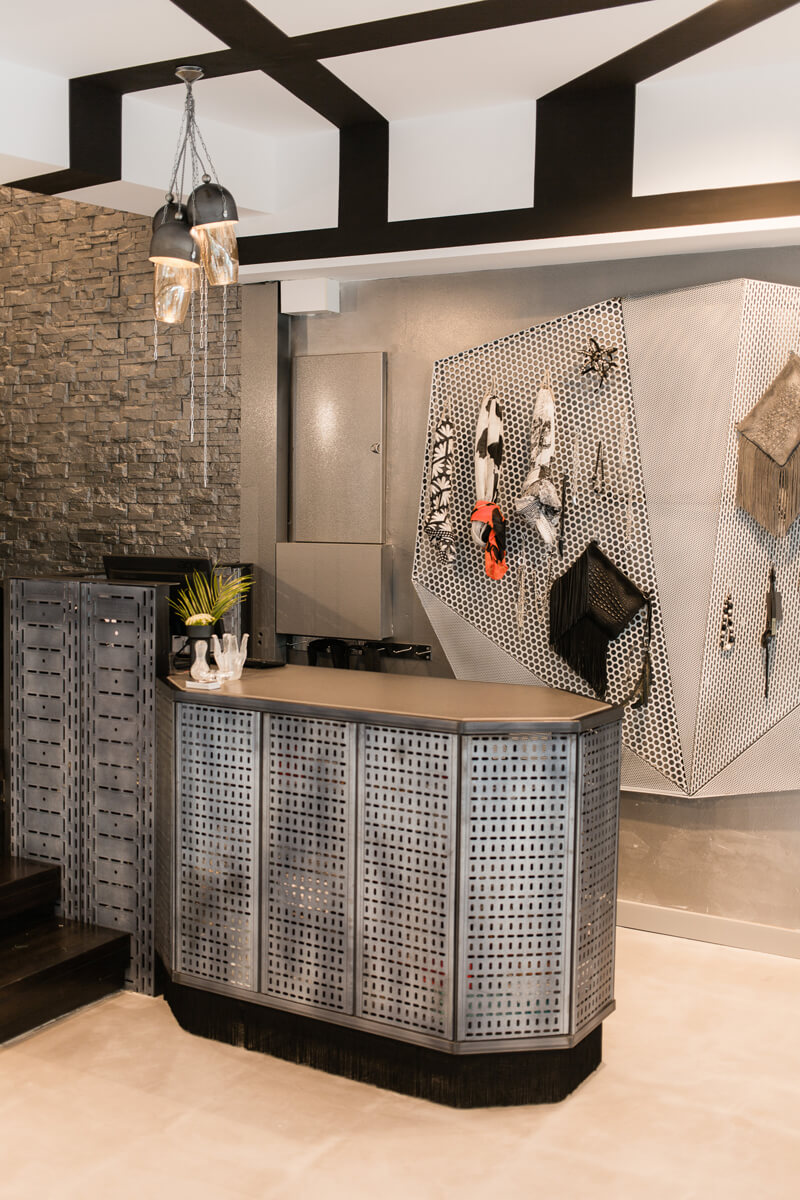
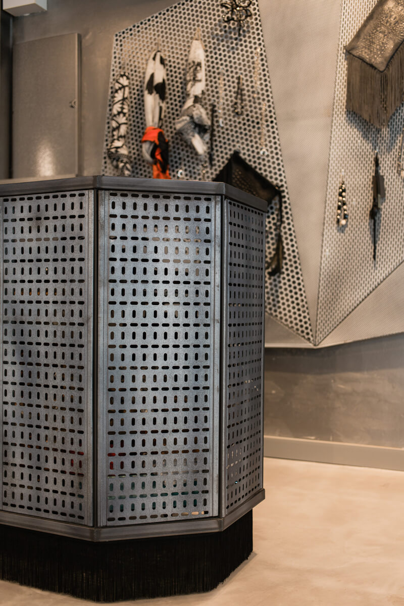
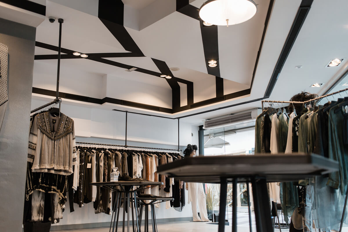
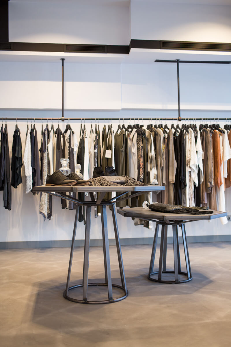
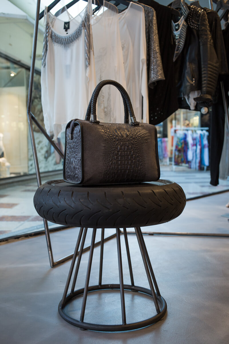
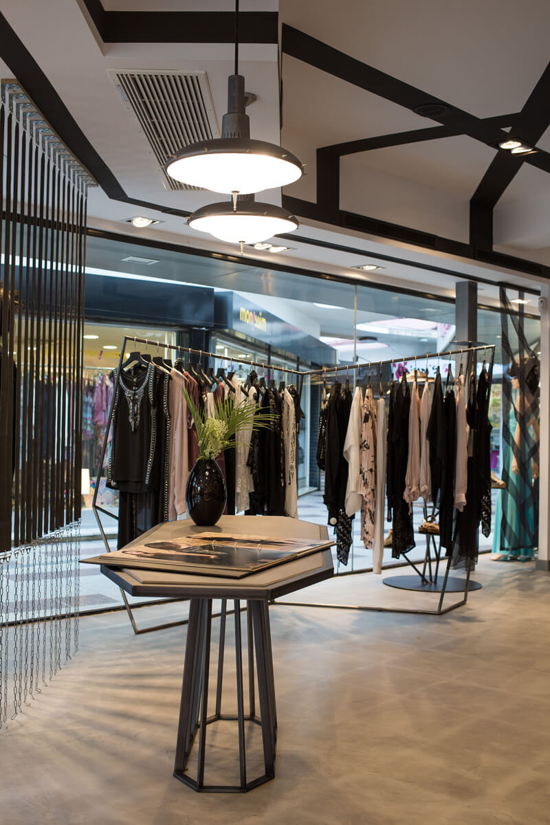
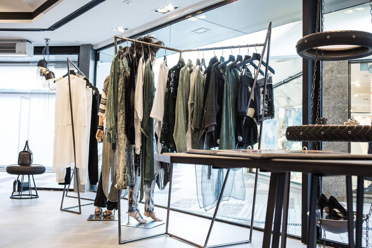
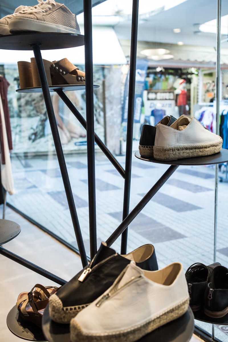
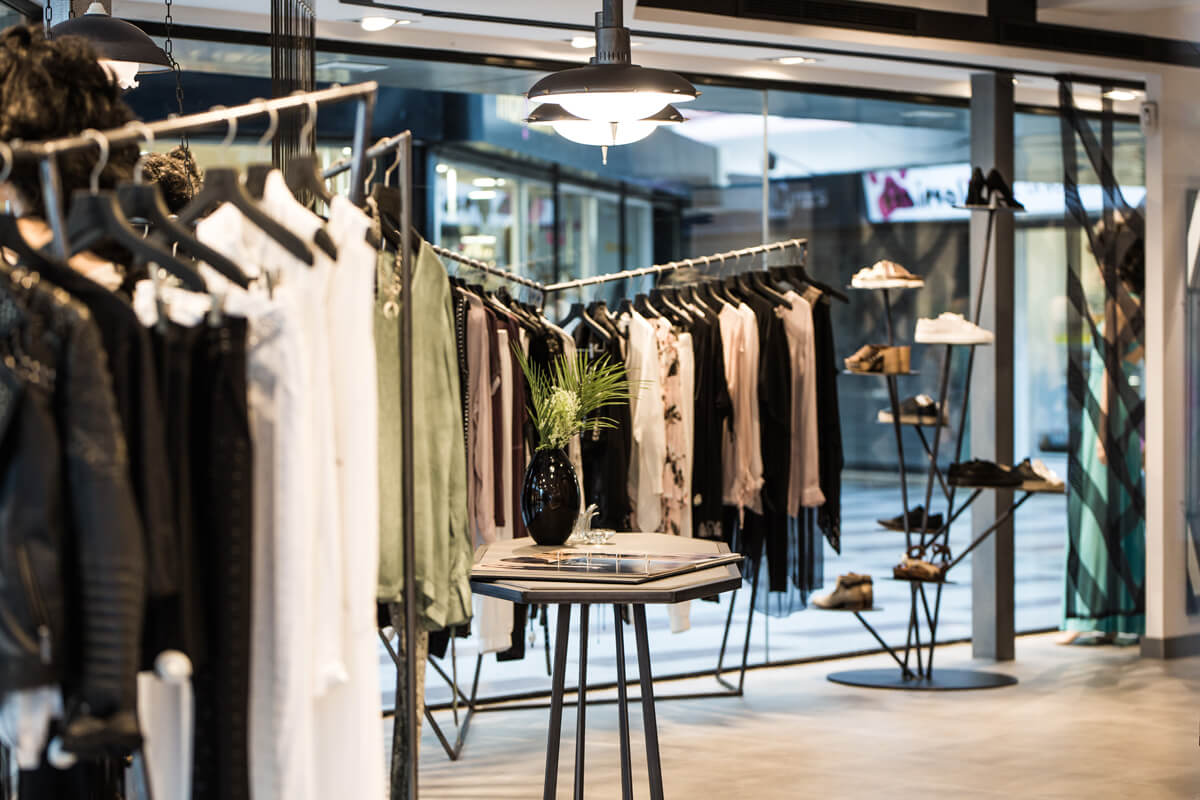
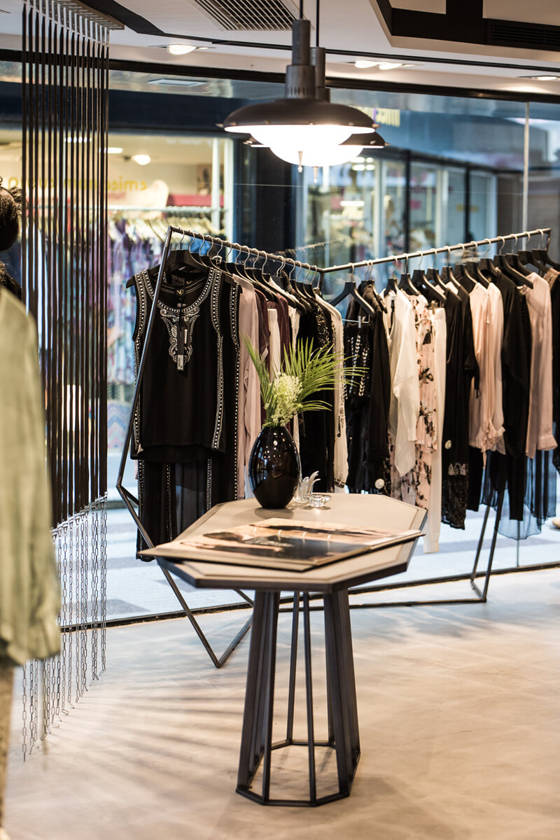
For NÜ’s interior design we were mainly based on the accessories and specific details that the brand uses for its designs: we’ve realised how important these are as a hallmark for the brand and we’ve applied them on the objects as well as on the furniture and decorative elements.
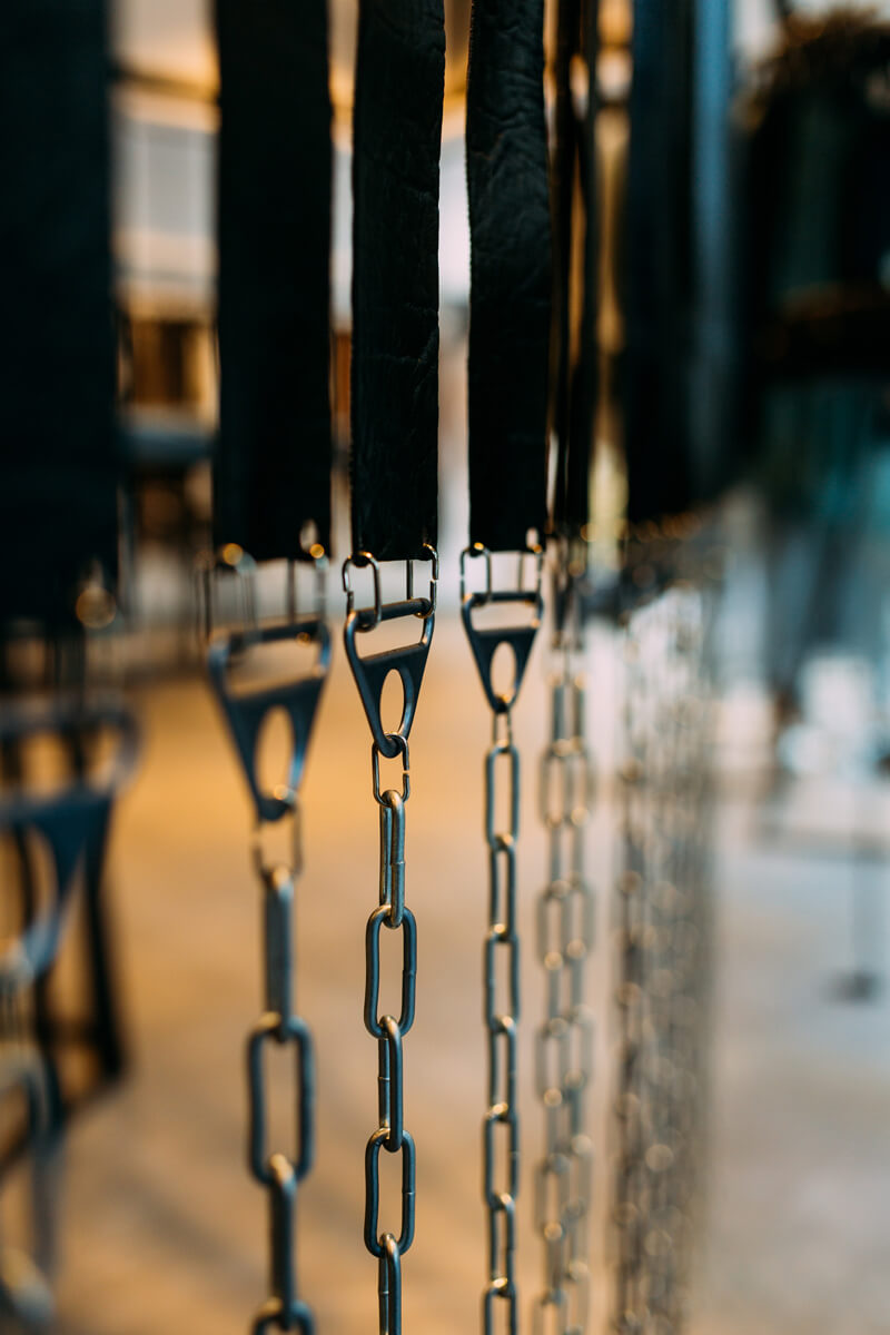
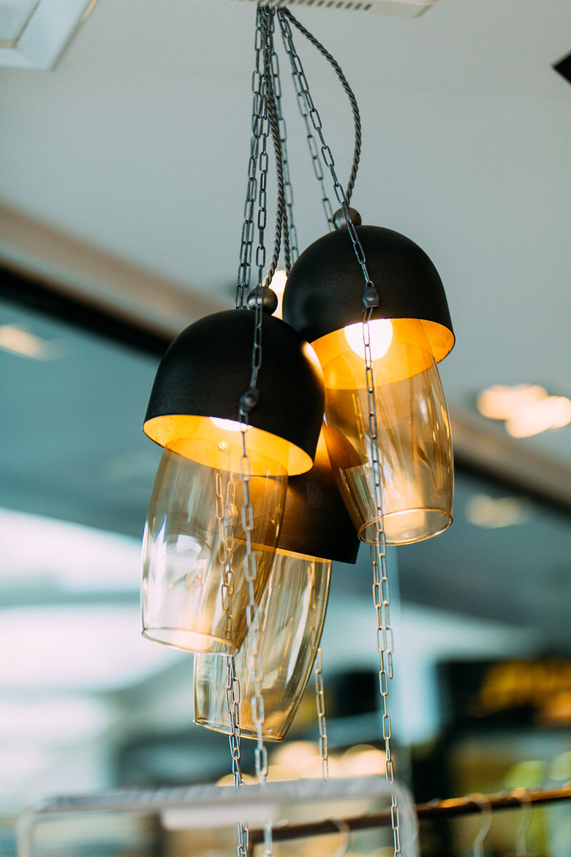
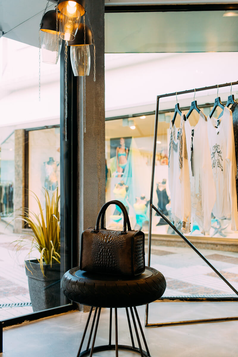
We’ve opted for an interior design based on diagonal lines and geometric shapes – inspired by those applied on the clothes; for white, black and grey colours while combining iron, metal, cement and leather. In this sense, putting together a baroque style with a more biker, punk-like touch, the space is dominated by chains, wireways, rubber and motorbike tyres, screws, rivets, tacks and beads from textile. Furniture, lamps, materials and designs get inspiration from the brand’s style and products, aiming at imitating the effect and the textures of these.
Because of this, from Pichiglas Studio we really like the brand idea behind NÜ and we want to emphasize the opportunity to keep going this way: the possibility to develop a set of stores which, the same way as this first one, revolve around a common concept that is appropriate for a brand with so much personality as NÜ; a concept that is powerful enough to empower its value, coherence and identity. Thus, from Pichiglas Studio we would love to be part of your project with regard to future stores, and even regarding a possible concept of corner for big malls or stands for fairs.


